HOLO 3: The Grid
“Conceptually, we were interested in creating tension by offsetting texts that, as Nora N. Khan noted, only ‘talk about technology obliquely,’ with a very technical form.”
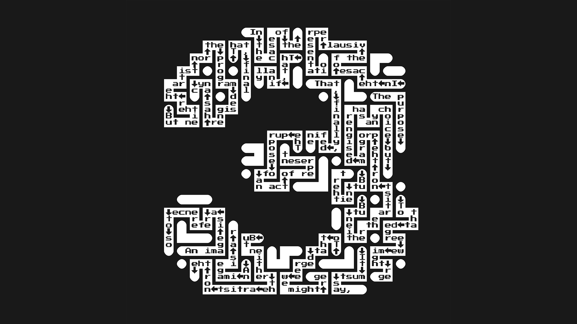
“So while the authors ruminate on enchantment, mysticism, and the limits of human knowledge, the design speaks ‘assembly language.’”
We’ve stated it here before but it bears repeating: the most exciting part of reimagining HOLO 3 as the first of many HOLO Annuals was making room for other people’s ideas. It sounds cliché, but working closely with and handing control over to guest editor Nora N. Khan and her research partner Peli Grietzer helps us see this magazine and what it can be with fresh eyes. The same is true, of course, for the many new contributors, all interdisciplinary luminaries in their own right. Quite frankly, HOLO 3—the Annual—is a magazine that we, previously, couldn’t make. And that’s amazing!
But there’s also continuity. With so many new hands shaping the new edition, it felt right to bring back a few former collaborators without whom HOLO wouldn’t be the publication it is today. There’s trusted Andrew Wilmot, for example, a Canadian artist and author who expertly copyedited and proofread HOLO 1 and 2. We’re also thrilled to be working with the same Berlin-based art book printer, now called Druckhaus Sportflieger, that produced the previous editions. And where would we be without our distributor of many years: OML, part of the indie publishing hub Heftwerk, is gearing up to ship HOLO 3.
Yet, few collaborators have been more instrumental to HOLO’s distinction than Jan Spading and Oliver Griep of the Hamburg-based design studio zmyk. Over the years, they’ve laid out and obsessed over literally hundreds of HOLO pages and it is thanks to them, their experience, instincts, and diligence, that issue 1 and 2 made such a mark. So when HOLO 3—the Annual—came into vision, we had to invite them back. Over the past several months, the two accomplished art directors have been busy developing a new design language that speaks to and advances the Annual’s vision. With the print date nearing, we asked Jan and Oliver to share some insight into the design logic and development process (without giving too much away).
“We’ve drawn inspiration from early issues of Popular Mechanics and Mechanix Illustrated from the 1960s and mixed those influences with the clarity and restraint we find in monographs and architectural drawings.”
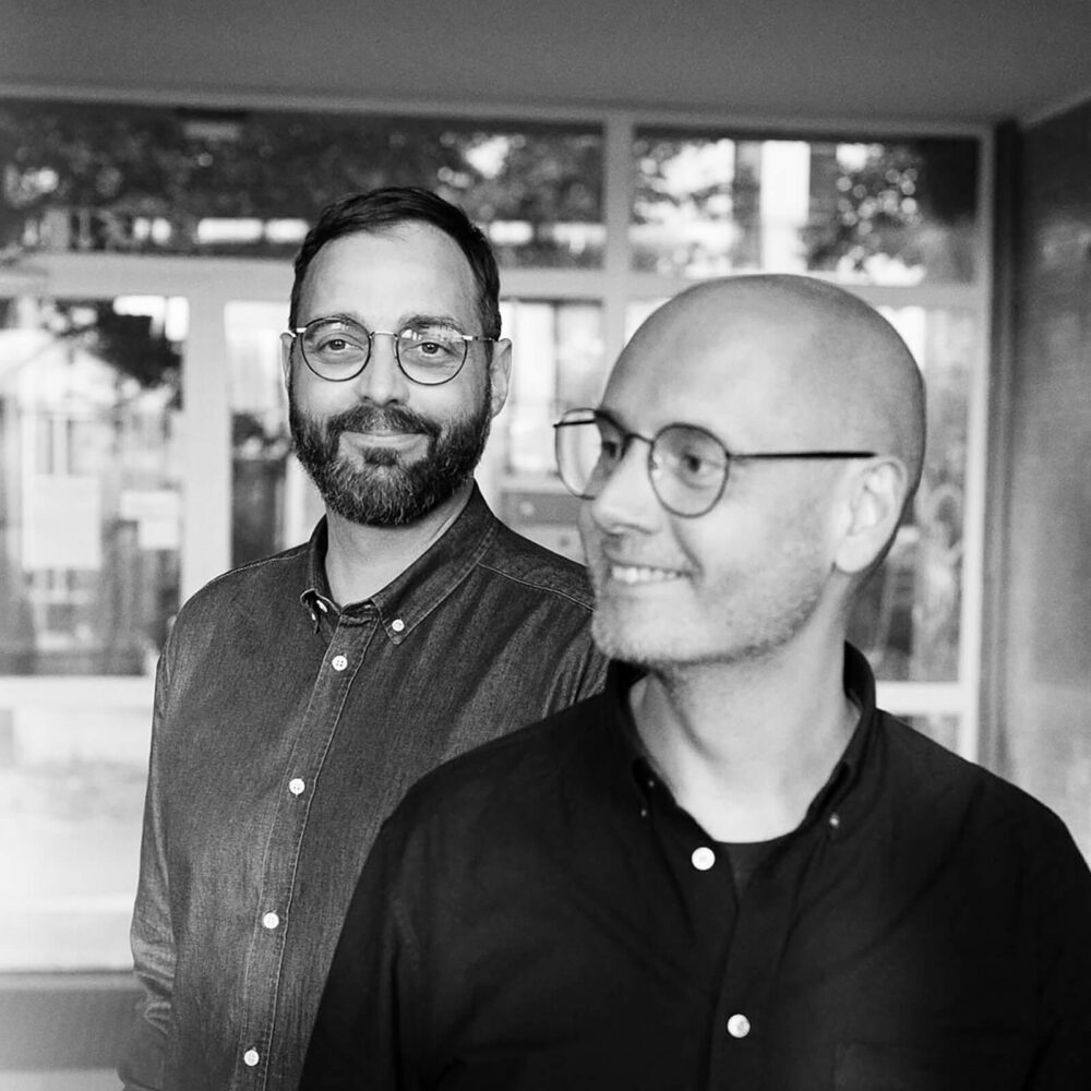
Regularly listed among Germany’s top design studios, the team of Jan Spading and Oliver Griep otherwise known as zmyk specializes in crafting cutting-edge books and magazines. Over the years, the two award-winning art directors have shaped signature publications such as DUMMY, fluter, and Frankfurter Rundschau and authored printed matter for clients such as Ostkreuz, brand eins Verlag, and Universal Music. Trivia: zmyk was founded in 2013, making HOLO one of the studio’s first imprints. (photo: Heinrich Holtgreve)
Q: It’s been five years since the release of HOLO 2. Then, out of the blue, an invitation to design HOLO 3. How big was the surprise?
A: Seismic! It so happens that we had leafed through HOLO 2 just a few days prior, wondering how team HOLO is doing. Coincidence? We think not ; ) .
Q: HOLO 3—the Annual—is a re-imagination of our print magazine, also visually. What can readers expect from the new design?
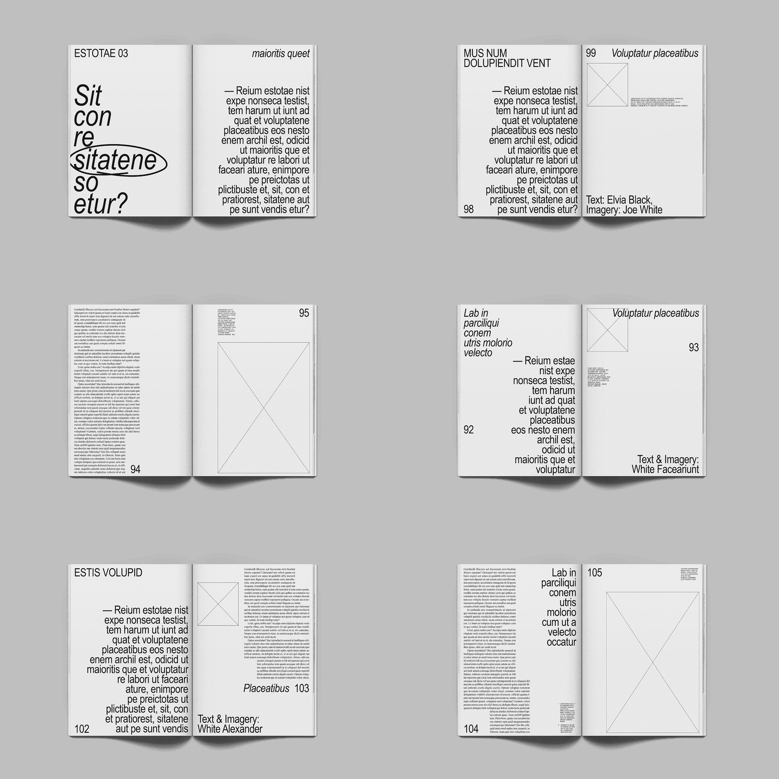
A: More cohesiveness, for starters. Whereas previous editions featured more book-like and more magazine-like sections, the new issue will feel seamless: a topical journey in four coherent chapters. Conceptually, we were interested in creating tension by offsetting texts that, as editor Nora N. Khan noted, only “talk about technology obliquely,” with a very technical form. So while the authors ruminate on enchantment, mysticism, and the limits of human knowledge, the design speaks ‘assembly language.’ We’ve drawn inspiration from early issues of Popular Mechanics and Mechanix Illustrated from the 1960s and mixed those influences with the clarity and restraint we find in monographs and architectural drawings.
Q: Can you reveal any design specifics?
A: First and foremost, HOLO 3 will be more compact—thankfully so, as the heftiness of previous editions made them a little unwieldy. Typographically, we’re drawing from traditional letterpress (Suisse Works), manual press (Suisse Int’l Mono), and early digital word processing (Arial Narrow)—a mix that we feel captures the essence of this issue. The layout is based on a simple 10 column grid with very narrow margins. We also decided against conventional pagination and instead developed a dynamic system that responds to the content on the page.
Q: With HOLO 2, you won a prestigious ADC Award, one of Germany’s highest honours for a magazine. How does the issue‘s design hold up today?
A: It aged very well, also thanks to the great material and people we got to work with. The generative layout of the “Stream” timeline, for example, was quite innovative. Working with digital artist Ted Davis, we distributed more than 2,000 images over four pages—which nearly killed one of our laptops. Looking back, there’s an uncompromising severity in how the design of this particular issue brings together striking imagery and great writing that we’re still very proud of. So yeah, the stakes for HOLO 3 are very high.
“There’s a severity in how past editions brought together striking imagery and great writing that we’re still very proud of. So yeah, the stakes for HOLO 3 are very high.”
Alexander Scholz
Alex is a Berlin-based writer, artistic director, and cultural worker. As the founder and creative director of HOLO, he helps produce and disseminate knowledge on disciplinary interstices, artistic research, and cultural transformations in the digital age. Over the years, he curated exhibitions, conferences, and educational programmes for organizations and festivals including A.C.C. (KR), Mapping (CH), MUTEK (CA), and NODE Forum for Digital Arts (DE).
